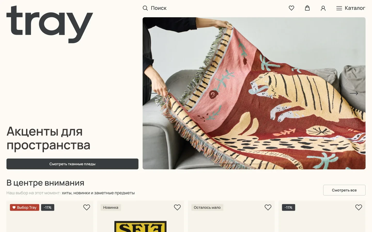
tray.design is Tray's storefront, where customers pick products, check out, and track orders. The goal wasn't just to build a website, but to move sales off the marketplaces. That meant buying here had to be as easy as on a marketplace, and the site had to look like a brand, not like one more catalog.
Architecture
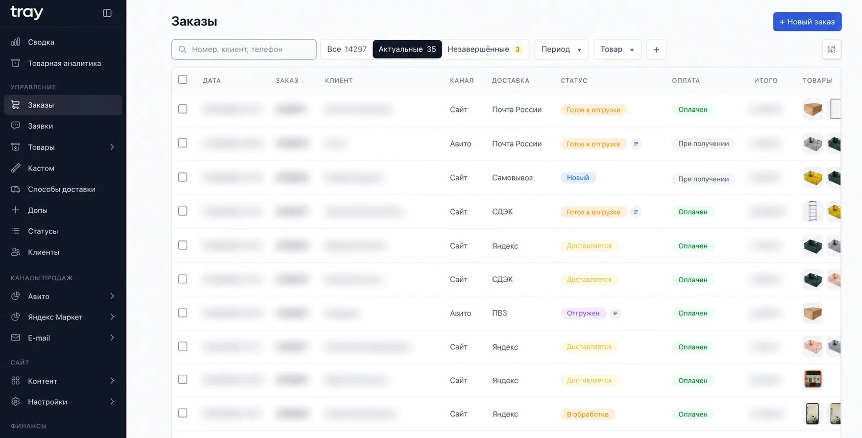
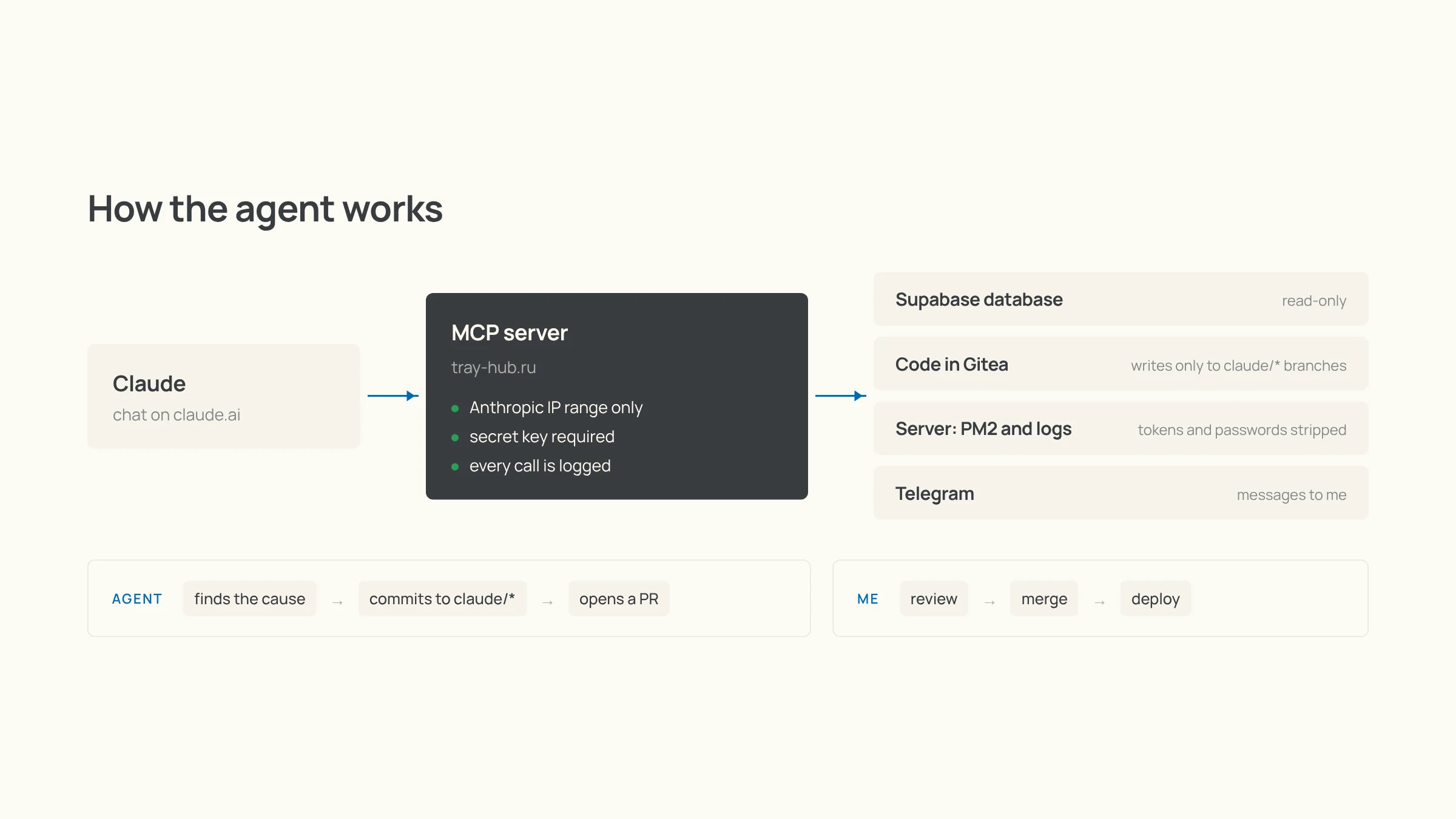
I designed the storefront as headless: one database that the admin edits, while the site only shows the data and takes orders. I looked at ready-made engines like Medusa, but they don't know the Russian specifics — YooKassa, ApiShip, marketplace feeds — and would have needed reworking for all of it.
Design
With a designer, we made the key screens and a guideline, building on the old site. I built the rest of the pages myself in Claude Design, following that guideline. That cut design costs a lot while keeping the brand style: the site doesn't look generated, because every new screen builds on a visual language the brand already had. I did the responsive layout for every screen size myself.
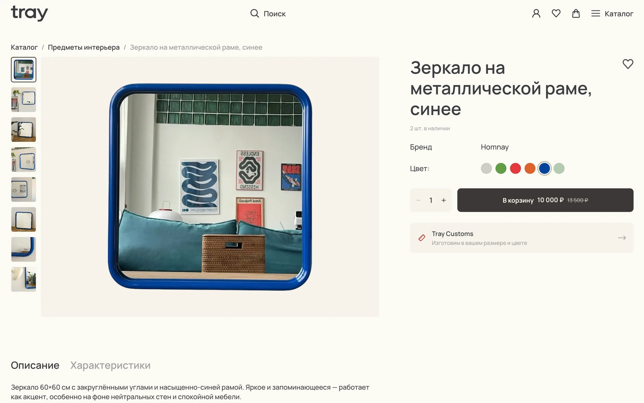
The customer journey
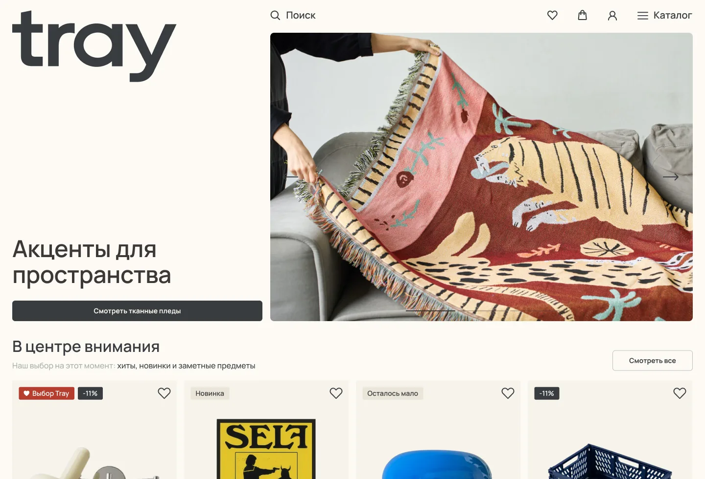
The homepage and collections are put together in the admin, so the team can quickly push new arrivals or what needs to sell. That's where the "Selling fast" and "Last pieces" sections came from: they honestly show that stock is low and nudge people to buy, without fake countdown timers. The product page has color variants, a description and specs, favorites, and catalog search.
Cart and shipping
The hardest part. Some products ship from our warehouse in St. Petersburg, some from suppliers in other cities, furniture has its own delivery options, and fragile items need a crate. I built the rules in four levels: a directory of delivery methods, the vendor, the product, and the cart logic on top. The cart groups items by warehouse on its own: if assembly takes up to three days, everything ships in one package; if longer, the order splits into shipments. Each group only shows delivery options that fit, and store pickup is hidden if the item isn't in our warehouse. The customer still pays once, and each shipment gets its own status and tracking number.
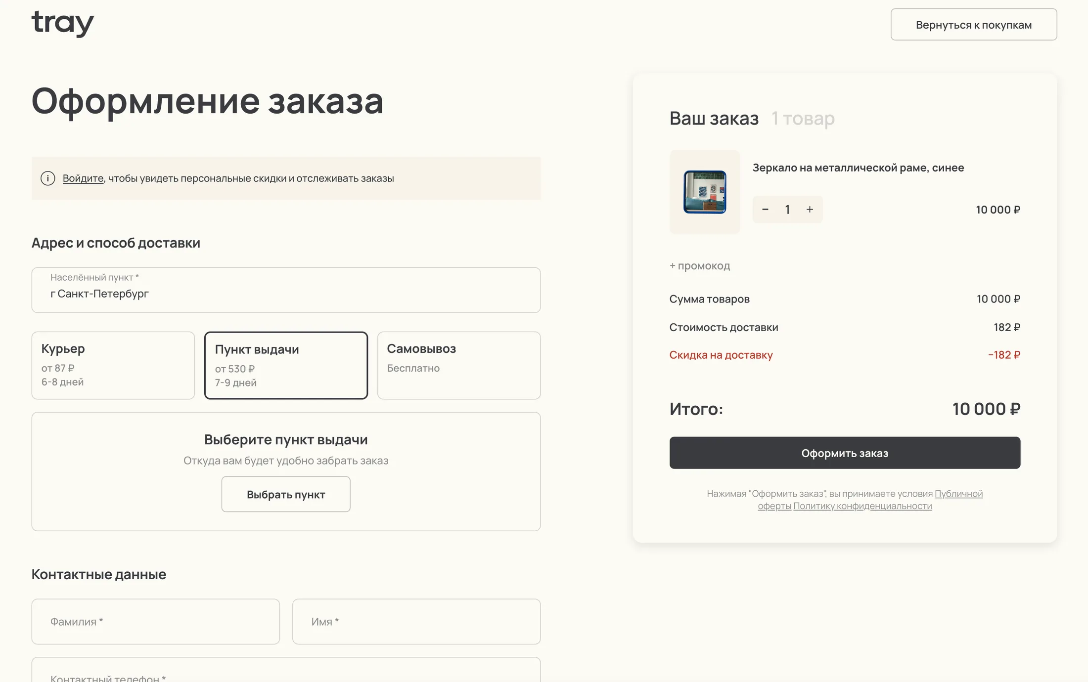
A lot of the work went into the small things where customers usually trip up. If the carrier can't calculate the price, the site doesn't show an error — it offers to place the order and arrange shipping manually. If the customer changes their city, the selected pickup point resets so the order doesn't go to the wrong one. Assembly time is included in the delivery estimate right away, and the thank-you page shows the order number and a plain-language carrier name.
Customer account
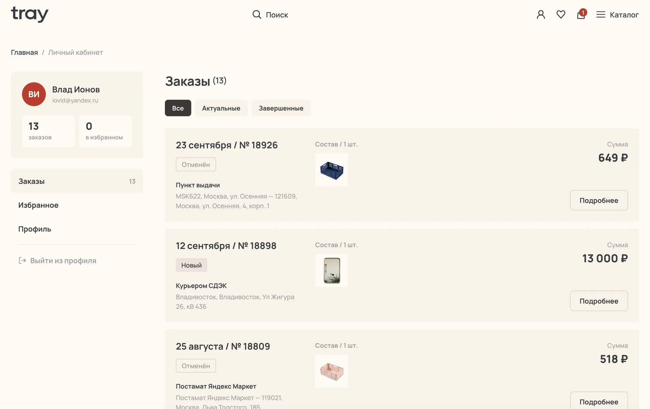
Login with an SMS code, no passwords. I didn't plug in a ready-made auth system: for "enter your phone and see your orders," my own sessions and code limits were enough. Old InSales orders are linked to the customer by phone number automatically, so the full purchase history is there from the first login.
The move
With the launch, the site moved to a new domain, tray.design. To keep search traffic, I gave 240 products and 27 categories English URLs and set up 271 redirects from the old pages.
The storefront is the face of the system, and everything behind it lives in the admin. How that works is in the CMS and CRM case.